Accessibility is part of the build, not a final check

Building keyboard-friendly, responsive interfaces with readable content and clear feedback.
Start with access, not appearance
Accessibility begins with people being able to read, navigate and understand the experience. Text contrast, clear focus indicators, meaningful labels, logical heading structure and keyboard support belong in the product design from the start.

Responsive layouts need meaningful order
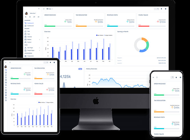
A desktop row may become a mobile column. That change should preserve meaning, not just squeeze the same pieces into a smaller width. Important actions should stay visible, labels should remain readable and touch targets should be comfortable.
Messages should help people recover
An error message should explain what happened and what to try next. A success message should reflect an action that truly completed. These details matter when people are managing information, payments, appointments or documents.
Keep checking the reality
Automated tests can catch some problems, but hands-on review still matters. Accessibility should be revisited as products change, not saved for one audit just before a launch.
From T1K1 Co Creative Studio. This studio journal article is an editorial overview. For verified features, availability and installation, see the official product or studio destination.