Inside Kitsuly: why a visual builder should feel visual
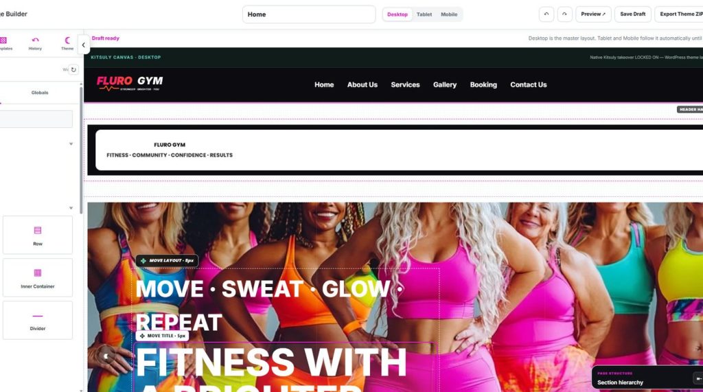
A design-led approach to pages, sections, responsive controls and real editing.
The editor is the experience
A visual builder should not make you guess how the published site will look. A more useful approach keeps the canvas true to the visitor experience and the editing tools close to the elements that need attention.
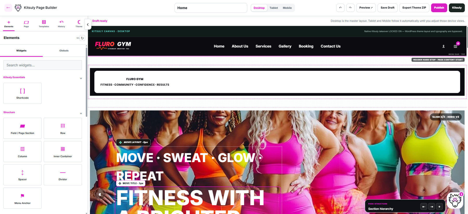
Sections, not a pile of panels
Layouts are easier to understand when they begin with sections. Each section has a purpose, then rows, columns, text, imagery and interactions can be shaped within it. A user should be able to move a piece of content without accidentally changing unrelated elements.
Responsive from the first decision
Good desktop design is only half the job. Tablet and mobile layouts must be deliberate, with controls that make navigation, text size, spacing and content order simple to adjust. An editor should make those trade-offs visible rather than burying them in settings.
A platform that grows
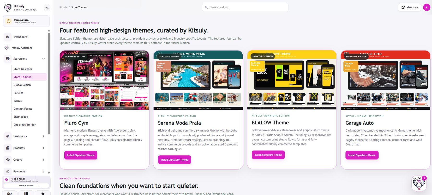
Kitsuly continues to combine storefront design with commerce operations. The design work and the operational work inform one another because a better page-builder should connect cleanly to the rest of the business.
From T1K1 Co Creative Studio. This studio journal article is an editorial overview. For verified features, availability and installation, see the official product or studio destination.